Look before you leap, or fly, in this case.
A Hopper UX Case Study
Many of my more wanderlust inspired friends have had Hopper in their planning toolkit for traveling abroad. Hopper is an AI-driven flight booking app focused on finding user’s great deals on flights. In early 2018 I had the chance to use it myself while planning a trip to Europe. Now that I can consider myself a bonafide user, as an exercise I decided to audit Hopper’s usability in an attempt to optimize for more than just pricing of flights, but also the efficiency in the process of securing those flights in-app.
Note: I am in no way affiliated with Hopper. This is a self-assigned project. -Brookes
I wanted to learn what usability problems users might be having looking for flights in Hopper. After synthesizing my user research, I identified multiple pain points that individuals were experiencing. I sorted and prioritized pain points, ideated and designed solutions, later developing a prototype to test and validate my solutions.
OVERVIEW
Pre-flight checklist item #1: Learning how to fly.
METHOD
While I began with some ideas of potential pain points based on my own experience, I needed to confirm or discover other user’s reactions. To do this I decided to hit the streets and perform guerilla usability testing.
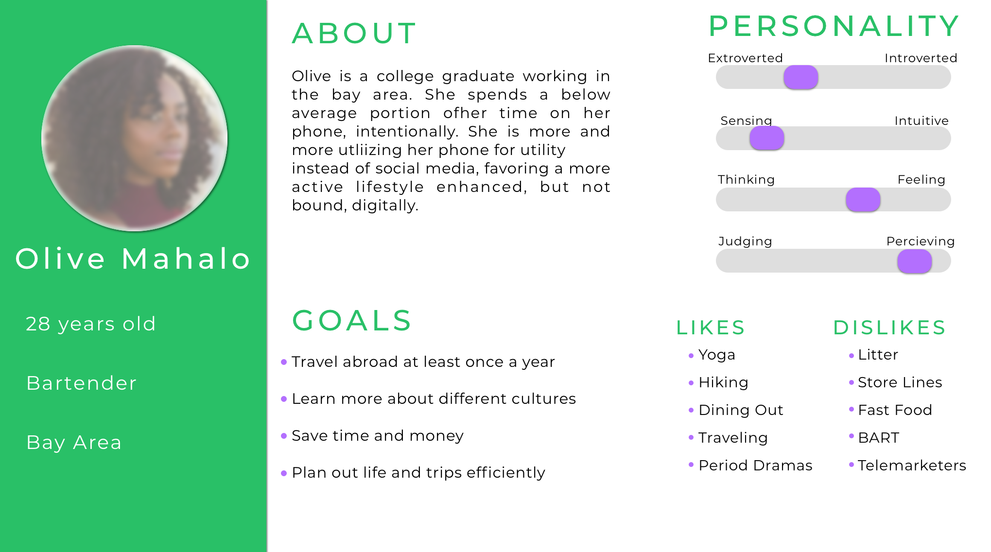
Enter Olive.
PROVISIONAL PERSONA
I developed this provisional persona as a guideline for choosing which people on whom to conduct user testing, a frequent or potential user of Hopper. This persona was crafted out of Hopper users, amalgamated from acquaintances, friends, and reviewers of the internet.
I decided on guerilla usability testing because, being unaffiliated with Hopper, I had no access to pre-existing data. So out into the world I went, to find 5 willing participants to test the app with me. I chose 5 because performing a usability test with 5 people will help you discover 93% of what is possible to discover.
I developed a set of tasks and wove them into scenarios that would run a user through the typical process of finding a good deal on a flight within Hopper.
USABILITY TESTING
Book a flight from SFO to the next place you’d like to travel, for a week in April.
Change the departure airport to OAK to see if the flight price is lower.
Utilize the watch function to save the flight instead of booking, to wait for a better deal.
Explore the possibility of flex dates to find a better price around the same time.
IDENTIFY PAIN-POINTS
I took detailed notes as users went through the tasks. I then reviewed a video and notes from each session and compiled friction points and issues onto post-its color coded per user. Color coding allowed the ability to establish frequency of issues across a range of users.
ANALYSIS & SYNTHESIS
I theorized some solutions to these friction areas on new post-its, then put them all on a 2x2 to prioritize which solutions would provide higher benefit, for Hopper and/or the user. The highest frequency pain points revolved around:
Inability to smoothly change airports while searching for optimal pricing.
The pricing view page having multiple ambiguous modals that appeared to be interactive, or were expected to be interactive.
The meaning & UI functionality of Flex Dates
TASK FLOWS
I decided to prioritize solving issues that would provide the users an optimized, smoother experience. Theoretically this would provide Hopper with a higher chance of converting a user into a customer.
Refining ideas into jet-fuel.
LO-FI IDEATION
Before making any high fidelity changes, I iterated on some possible solutions to help guide which concepts would concepts be the best to implement.
HI-FI EDITS
Armed with ideas that were validated with a quick pencil brainstorming session, I took my sketching to the computer and created them visually within the app.
PROTOTYPING
With my solutions now fleshed out, I created a prototype to confirm these design solutions had solved the problems they were intended to fix. You can access it below:
Disembarking & looking forward.
Keep it simple.
Users expect commonly used functions to be easy to locate and understand. Making them search and hunt for these key features causes unwanted frustration in completing core tasks.
Use it or Lose It.
Solving unnecessary friction is paramount for enabling users to reach their end goal in an app designed to provide a service.
Understand your users.
Empathy is key in the design process. What is important to a designer may be completely invisible to the average person. Understanding what is important to your users allows you to emphasize the right solutions.


